Blog

A Starting Point

Illy found herself tuning out the many conversations around her as she usually did when riding the public transit to school. She had earbuds jammed into her ears intending to ward off people from speaking to her, even without music actually playing it was a tactic that never failed her. She sighed as the subway lurched unexpectedly, tossing her onto the lap of the stranger seated before her.

“Pardon me,” she stuttered out, shakily removing herself from the stranger’s lap. She cursed in her head at herself for letting that happen in the first place, she should have been holding on more tightly to the cool silver pole.

The stranger smiled at her with fake warmth, not saying a word. She could tell they were trying their best to not make a scene on the crowded subway, certainly not this early in the morning at least. Illy noted that the stranger, like everyone else she has seen, was made up of crazy colors and patterns and had other strange appendages.

To anyone else, seeing someone with neon green and electric blue striped skin would be abnormal and quite freakish, but for Illy it was just another day. To Illy this was completely normal, she had seen similar all her life, and the only way she knew this wasn’t normal to everyone else was by their reactions whenever she drew their portraits like this.

“Gross!”

“What the hell is that?”

“That isn’t me!”

“Freaky!”

Some of the standard responses she had gotten for them. It had really confused her when she first started getting these comments, she had felt proud at her ability to capture their strange likeness on paper, and they were telling her it was terrible. She would hold the portrait up to them and compare it side by side to their faces, and confirm that they in fact were greatly alike, earning angry scoffs from her subject.

It certainly disheartened her at first, but she tried to get past this, telling herself it was accurate to what she saw and that’s all that should matter to her. Though it certainly got her on a lot of people’s bad sides.

The subway lurched again, but this time Illy held on tighter, now more conscious of herself to make sure she didn’t repeat her blunder from before. The subway slowed, and she looked around for the nearest exit to her; this was her stop. Once she found it, she slowly made her way towards it, careful not to fall over or bump into anyone.

Unfortunately, others were not as attentive as her, and someone smacked straight into her, knocking her into the doorway. Luckily, the subway hadn’t fully stopped yet and the door was still closed, otherwise it could have been a much more painful landing for Illy. She pursed her lips and turned her head to look at her “attacker”.

“Goodness! I’m so sorry dear, let me help you up,” a rather plain looking person extended their hand to Illy, a sympathetic look plastered on their face. They looked extremely different from everyone else on the subway; having no stripes or polkadots, no neon colors or intense eyes, just beautiful umber skin and subtle golden eyes. Their hair, a rich brown color rather than pastel pinks or blues.

Illy stared at them for a good long moment before she accepted the person’s hand. She was in shock, this person looked normal! Or rather, abnormal, compared to everyone else! She couldn’t get over the fact that they had no bright colors, no crazy patterns, no extra appendages…

“You alright, dear?”

Illy was so taken aback she couldn’t find her voice, it was if it had left her behind when she had gotten knocked over.

“Are you alright?”

Illy managed a small nod, as she grabbed hold of their hand, allowing them to help lift her up and out of the subway car onto the platform.

“Look, I’m real sorry I knocked you down…”

Illy nodded again, still unable to produce any sound.

“Can I make it up to you somehow, take you out for coffee sometime, or?”

Illy nodded once more.

“Great! Um, here!” The person pulled out a navy blue sharpie from their back pocket, “do you mind?” They gestured with the sharpie towards Illy’s arm.

Illy shook her head and jutted out her left arm.

The person scribbled down ten digits that Illy supposed made up their phone number, “alright! There we go! Give me a call when you find your voice, dear,” they smiled playfully at Illy, winked, and faded away into the large crowd.

Illy stood, frozen in place for a few minutes, absolutely flabbergasted that they, like her, didn’t look anything like everyone else in the world. She had never, in her entire life, met anyone who was different like her. So many questions swirled through her mind all at once. But perhaps the most important one was did they see the world like she does too?

It was then she remembered the number scrawled onto her arm, and the invitation out for coffee, “yes! I can ask them when we meet up!” she exclaimed a bit louder than she would have liked, earning quite a few stares from the people around her.

She quickly covered her mouth and ran out of the station and to the nearest payphone. Forgetting entirely about school, she threw two quarters into the front of the payphone and dialed in the navy blue numbers from her arm.

The phone rang a few times and then clicked, “well that was fast,” the voice chuckled out.

Illy stood there a moment, feeling once again unable to speak.

“Still speechless, huh?”

Silence from Illy.

“Or perhaps you hung up on me?”

“N-No!” Illy croaked out, desperate to keep them on the line. She had to meet them again. She had to ask them if they were like her.

“Oh! There’s your voice,” Illy could hear their smile through the phone.

“Coffee?” Illy blurted out, rather embarrassingly.

“Right now?”

Illy’s stomach knotted up, she felt like a fool.

“Sure. You know the little coffee shop down the street a ways from the station?”

Illy nodded, then smacked her forehead, noting that the person couldn’t actually see her nod, “yes.”

“Great! Meet you there in fifteen.”

Illy heard another click and replaced the phone back onto its receiver. She stopped around excitedly, once again earning stares from the brightly colored people around her. Boy, was she really embarrassing herself today.


When she entered the coffee shop she felt her stomach drop as all eyes seemed to be on her. She quickly ran to an empty table and sat down, hiding her face behind her arms.

“Well hello there, fancy meeting you here,” Illy shot up in her seat to find the person she was waiting for had arrived.

“Hello,” her voice was no higher than a whisper, and she winced when she saw the person raise their brow at her. She cleared her throat and tried again, “hello!”

“Hello there,” they smiled at her with genuine warmth.

“My name’s Illy,” she thrust her hand out at the person.

They took it graciously and shook it, “Nina.”

“What a lovely name…” she mumbled, causing Nina to chuckle.

“Why thank you dear!” Nina took the seat across from Illy and placed her hands on the table, “so, what made you call me so quickly? I think that’s the fastest I’ve ever gotten a girl to call me after giving her my number,” they smile playfully.

“Oh… um, well, you see. You’re not like everyone else.”

“My! That’s quite the pickup line.”

“No no! That’s not what I meant. I just.”

Nina smiles and nods, but doesn’t say anything more, giving Illy a chance to explain herself.

“It’s just… you see… Okay, this is going to sound really strange, but just… hear me out, alright?”

Nina nods again, and Illy feels her face heat up, wondering if they were poking fun at how all she could do earlier was nod.

Illy eyes them for a moment before continuing, “it’s just, when you look around you, what do you see?”

Nina glanced around the coffee shop, “I see lots of people.”

“Yes, but what kind of people?”

“Late teens, early twenties, probably should be at school,” Nina smiles playfully.

“Yes, but,” Illy’s eyes go wide, “hey!! Shouldn’t you be at school? Or work? Or something?”

Nina just chuckles and shakes her head, “sorry, sorry.”

“May I continue?”

Nina nods.

Illy sighs, but continues on, “don’t they look strange? The people?”

“No, they look how they’ve always looked.”

Illy sinks in her seat, wondering if she made a mistake in asking Nina these questions. Of course they didn’t see people the way she had, even if they looked like Illy and not like everyone else.

“Something wrong?” Nina looked at Illy with concern in her eyes. Genuine concern. This comforted Illy a bit at least, to see that Nina was possibly taking this seriously.

“No, it’s just… you look different. Different than all of them. They look strange and weird, and you look… normal. Or maybe you look strange and weird, because seeing them as they are is my normal. Look, it’s really hard to explain, er, how about I just show you?”

Nina raised a brow curiously.

Illy smiled shakily, hoping she wasn’t scaring Nina off, but then again, if she was, Nina probably wouldn’t have sat with her so long. She pulled her worn out messenger bag into her lap and flipped it open, pulling a sketchbook and a tin of colored pencils out of it. She carefully opened the sketchbook to a blank page, “point out someone you want me to draw.”

Nina didn’t even hesitate, “him,” they motioned towards the man working at the counter of the shop.

Illy began to let her pencils glide over the sheet of paper. She kept her eyes on the man, rarely looking down at her sketch. She noted his pink and blue polkadotted skin, his bright yellow eyes, and sharp toothy smile. The man glanced over at Illy, and the two connected eyes for a moment. She felt her heart tighten, having been caught, but kept on drawing.

Nina watched Illy with curiosity and fascination, whispering a few “wow”s and “incredible”s as Illy’s sketch began to form into a solid portrait.

“There,” Illy stated, flicking the last few bits of color onto the page and sliding the sketchbook across the table for Nina to examine.

Nina graciously takes the sketchbook and lifts it up closer to them. She studies the portrait thoroughly, causing Illy to panic a bit.

“What do you… think?” If Illy’s stomach wasn’t knotted before, it most certainly was now. She felt sick, awaiting Nina’s response, predicting that they, like the others, would be disgusted with it. She squeezed onto her left hand tightly, hoping to relief some of the anxiety, but perhaps only making it worse.

“It’s-”

Illy winced, waiting for Nina to deliver the blow.

“Amazing!”

“What?” Illy let go of her left hand and also let her jaw drop.

“What?”

“What did you say?”

“It’s amazing?”

“Do you really think that?” Illy leaned in closer to Nina.

“Of course! It looks just like him!”

“It-what? It does?”

Nina furrowed their brow, confused by Illy’s reaction to her thoughts on the portrait, “should it not?”

“No no no! It definitely should! It’s just… no one’s ever said that before! They always get mad, or they say I’m playing around drawing people like that… but it’s what I see. He really looks like this!”

“He really does,” they nodded, switching their gaze back and forth from the man to the sketchbook, comparing the two.

Illy felt her heart race. Finally! Someone who’s like her! She’s not alone anymore!

“I mean, I could totally see him with sharp teeth and crazy eyes,” Nina chuckles.

“What?” In a split second Illy felt her mood flop. Oh god, of course they weren’t like her, of course! How could she be so stupid to hope that someone was like her, that she wasn’t alone…

Nina stared at Illy deadpan for a moment before busting out into a hearty laugh, “I’m kidding! I’m totally messing with you. He really does look like that to me!”

The man glared at the two, and raised a finger to his mouth, telling them to “shut the hell up.”

“Whoops, Mr.Polkadots is getting very angry with us,” they continued to laugh out.

“So wait… he really looks like that to you? No lie?”

“No lie,” Nina makes a motion, crossing their heart and hoping to die.

“Wow.”

“Wow?”

“Well, I’ve never met someone who could also see them like I can…”

“Really?” Nina sounded quite surprised, which caught Illy off guard.

“What? Have you met others before who could?”

Nina grew silent and stared off behind Illy, “no,” they answered, frowning intensely.

“But you made it sound…” Illy began to notice Nina tensing up. Sensing there was more to the story than they were willing to tell her, she decided to not press them further on it. She sat awkwardly for a moment, tapping her fingers on the table. She looked up at Nina and cleared her throat, “anyways, it’s… really nice to finally meet someone who understands. I-I never met anyone who could see them like I do.”

Nina just nodded, still staring off.

“And well, it’s just that. I don’t really understand why I’m like this. Why I see things this way and no one else can. And I’ve been ridiculed for it… and it’s just, like I said, nice to finally meet someone who understands. At least someone who understands what it’s like, because I don’t really expect you to understand why we both see things like this when no one else does. And just, it’s um,” Illy shifts in her seat, “nice.”

Nina’s eyes flick over to Illy and focus on her now, “yeah.”

Illy feels her heart speed up again, matching the pace of her fingers’ tapping, “I’m sorry, um… am I rambling too much? Or boring you… or perhaps I’ve offended you?”

Nina snaps out of the trance-like state they were in, “no! Not at all! I’m sorry dear.”

“It’s okay,” Illy looks down at the table. She slides a hand over to her sketchbook that still lay in front of Nina and gently pulls it back towards her. She looks at the drawing and grimaces before closing the sketchbook and placing it back into her bag.

“No really, I mean it. You’re honestly not, I was just,” they breathe in, “thinking.”

Illy looks up at Nina inquisitively.

“I was just thinking about how excited you were to finally find someone who might be able to give you some answers, and I just, I don’t have any answers. I’m just as lost as you are…”

Illy slides her hand back onto the table, reaching out for Nina’s hand, “well,” she places her hand softly on top of Nina’s, “then we can be lost together.”
Notes 1

Some notes taken during my Seminar class this fall semester, either suggestions or thoughts I was having during discussion,

9/7/16

-Mentioned a 2D master copies assignment from Freshman year using cut paper. Perhaps try this with movie posters?

-Figure out a way to bring movie poster to people? Since most people don’t go out of their way to see movie posters, they only happen to see them if they’re going to the theater mostly.

-Make list posters. For example, make a checklist of stereotypes in movie poster design.

-People see posters, but don’t always realize that they are. For example, Netflix icons are the movie’s poster, just formatted to fit the thumbnail size, but many don’t know this.

-Make posters to draw people in about points of interest

-Conceive and market a Film Festival?

-Make posters on random or everyday objects. Misuse movie posters. Use them impractically? For example, a movie poster where a jug of milk is the star.

-Japanese movie pamphlets/program books are AWESOME, I wish we did that here.

-Why is it that I love movie posters? Explore this more.

-Maybe I like the posters more so as art, rather than having it make or break my decision to see a movie. Though, sometimes seeing a really cool poster online definitely makes me want to go and check out the movie. Kind of like how a book’s cover can entice someone to read the story inside. I also think I love movie posters for their designs, however many are following the same generic setups there are still some beautiful posters out there. Also, if the poster is really good and I really loved the movie, I love it even more because it represents that movie in some way.

Netflix/Movie Posters

It was mentioned in class how some don’t see many movie posters, they just see the thumbnails for movies on Netflix.

I joined Netflix with the free one month trial today to take a look and see the thumbnails for movies and compare them to their posters.

So far I’m finding that the thumbnails for the movies either are the poster, are the DVD cover, or are one of the two worked to fit the size and format of Netflix’s thumbnails.

So if you have been on Netflix viewing movies, you have definitely been seeing the movie’s posters in some form or another. At least from what I can tell so far, I’m going to do more comparisons to make sure. But currently I’ve checked a decent amount and they are the same as the movie posters (again, some slightly changed layout wise to fit in the thumbnail properly, but I still count that, since it would be the same imagery you associate with that movie’s poster)

Some More Thoughts…

As I continue researching I’m having some more thoughts, and since my other post was already super long, I’ve decided to make a new one.

Plus it’s not late night thoughts if I’m thinking them early in the morning.

So I guess early morning thoughts then? Anyways,

-I’m getting a lot of “somewhat”s on my survey to the question asking if a movie’s poster influences your decision to see a movie or not. I’m wondering if it’s because a.The poster is only a minor aspect to some people, or if it’s because b.The poster would really only make you inclined to see a movie if you liked it, and if you didn’t like it you would still probably see the movie because the poster is only one part of it’s marketing (and perhaps you like the trailers or other ads).

-Though, I suppose it could possibly turn you away from a movie if the poster featured problematic things. For example, (I know it’s not a movie poster, it was a billboard) the X-Men Apocalypse ad featuring the villain of the film choking Mystique, which sent the message that casual violence towards women is okay. A LOT of people were upset about this, and I can only imagine that at least a handful of them possibly didn’t see the movie because of it.

-Maybe I need to have a survey about the above thought. “If a movie poster featured problematic behaviors, would you be deterred from seeing the movie” Perhaps a question for a Twitter survey.

-One article (http://www.howdesign.com/design-business/design-news/26-great-movie-posters/) I’m reading says “She stops and stares at the movie posters even when the cast doesn’t include her one and only, and I join her—because great movie posters demand our attention. And they deserve it.” I’m wondering if age has something to do with relevance of movie posters to you. Because they do seem like they’d catch a child’s interest, since their interests are usually vast when younger, and more selective as they get older. So perhaps this has some effect on it? Perhaps ask the survey questions to children and see how the results vary.


Late Night Thoughts…

Some thoughts currently swimming around in my head, sort of in response to some of the discussion from my seminar class today.

-Movie posters aren’t what they once were. Not so much “art” any more as much as they are just another facet of marketing for a movie.

-Perhaps there’s a correlation to the fact that movies are now so expensive (ticket prices alone are at least $12 on most days, and can go as high as $17 for certain shows, not to mention food and drinks and whatever else you want while you’re there), people aren’t going to theaters as much, so they aren’t seeing posters as much. Since most people didn’t see the posters anywhere other than at a theater (so far from my survey answers at least).

-So then movie posters have less relevance because people aren’t seeing movies as much?

-Or perhaps it’s the fact that trailers in the theaters, on television, and online are so prominent that those are what draw people in nowadays rather than the posters themselves. So their meaning/importance has changed over time.

-Come to think of it, most times when you go to see a movie, the posters are (mostly) on the inside (though some are outside the theater) and on the way to the actual theater you will be seated in to see a movie. And if you’re carrying popcorn, drinks, candies; watching children, rushing to get in to a movie, more focused on finding which theater is the correct one for you, then you could miss seeing the posters entirely. You’re more focused on other things. And then, when you’re leaving and there’s a crowd leaving as well from the movie you’ve just seen, you’re probably just trying to get out of there or trying to use the restroom and then get out of there, and again, don’t see the posters.

-Then there’s the issue that you wouldn’t see all of the movie posters featured in one theater. Because chances are, if it’s a big enough theater, there’s two sides splitting up the amount of theaters in there, and you’ll only be going to one side of them, or be allowed entrance to one side depending on where the ticket takers are located. So there’s no way you’d see all of them…

-How do they decide what posters go on which side of the theater? Makes it harder to target specific audiences that way, since movies seem to play on either side with no rhyme or reason to it. It’s not like all the older teen/adult movies are on one side and the kids on the other and the posters match these target audiences… That would be a good idea to try actually though…

-Though! I did visit a theater near my school this past week, and they featured giant billboards/ads as well as posters for upcoming movies in the main part of the theater where you get tickets and snacks. And then on the way in to your specific theater they had older and more iconic movie posters decorating the walls. I thought this was really cool to see. I never see that. But that solves the issue of people not paying attention once they try to find their theaters, they would be looking at the posters for the upcoming movies while in line for tickets and concessions and such. That’s pretty smart actually. I like that. More theaters should do that.

-So if posters aren’t so important to getting people in the theaters to see movies, why spend the money making them? (I mean, I love them, so I think they should still be made, but just posing a question) Perhaps maybe to sell as merchandise afterwards? A few people answered my survey saying that they would consider purchasing a movie poster, mainly if they liked the design for it or liked the movie and the design for it.

-Next survey could be about how often people visit the theaters, and what they like to see when they go/what drives them to go and spend all this money at the movies. To see if maybe any of this data will relate to people’s views on movie posters and their importance (or lack thereof). 

-I wonder why the shift in media for movie posters happened. Like, what exactly started the trend of using photographs rather than illustrations or typography. Could this be replicated nowadays, but with bringing the posters back to the age of illustrations and typography? That might be interesting to explore. Will have to do some more research on this.

-Saw in one article that curiosity created by a poster can result in “on the spot ticket sales” Makes sense. But not sure if this would work nowadays. Because again, movies are expensive, and I feel like many people might not go to movies unless they are going for a specific movie that they know they already want to see. I rarely hear of anyone going to the movies, looking at the posters and/or titles of movies playing and picking one that sparks their curiosity and interests. But I guess I don’t have any actual data for this yet, I’m just hypothesizing. This leads back to one of my previous thoughts of creating another survey asking people about their visits to theaters, reasoning behind it, etc.

-I keep going back and forth on how I feel about all of this. I definitely see what people are saying, and hate to say this, but it’s looking like movie posters are in some way becoming “obsolete”… but I really hate saying that because I love them and don’t want them to become meaningless.

-Perhaps I’ll explore what it would take to make movie posters important and meaningful again. I really don’t want this form of design to die out.

-I’m so sorry this is all really long and is a lot of rambling. But I’m honestly really exhausted right now, and my mind is jumping all over the place. Though, I think it’ll be good for me to read later on, because this is kind of like a brainstorming session of all these ideas just ajsdfjklag out of my head.

-Explore the relationship of movie posters and the DVD covers for the same movies. See if they’re the same (since apparently some time ago they used to be the same), or similar in some way. Also, off of this, and off of what was mentioned in class, explore the relationship of movie posters and the Netflix thumbnails for them.


Senior Thesis: Take Two

Below you’ll find my revised proposal for my senior thesis. This time with more of a direction based on the things I’ve been posting on this blog.

“At the end of last semester’s review panel, I proposed that I would be creating my thesis around movies. I had described a few possible ways I could do this by explaining my interests in movies (the design work in movies, as well as movie posters, and also a personal connection to movies). However, I had too broad of a subject and not much of an actual proposal.

I have taken the summer to work on figuring out what it is that I want to do with movies. You all had some great suggestions for me, such as filming some movies, looking at movie title designs, and starting a blog. I filmed a few videos on my trip to Japan, I’ve been trying to look at movie titles and credits, and I have started a blog (which can be found here: https://alexandrabonin.wordpress.com/blog/) There you will see a variety of posts from me. You will notice that on my blog I gravitate towards movie posters more than any of the other areas. So I believe that is the direction I want to be going in.

But particularly I want to focus my first term of seminar (since I plan to take two terms) on studying the sort of psychology behind movie posters. I’ve noticed patterns and “formulas” that most posters follow in order to be “successful” (at least to the general public). This term I want to focus on breaking down these formulas, and deconstructing them; making my own formulas for interesting and creative movie posters. And in general just experimenting with movie posters.”


(DR) Ghostbusters (2016) Toys

Okay, remember how I said I was splitting the Design Reviews for this movie into other sections because otherwise it would be WAAAAAY too long? Well here’s the big one that would have caused it to be extremely long.

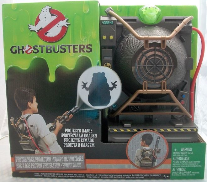
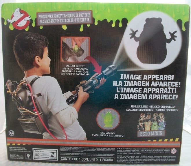
Not necessarily design directly in the movie, but heavily tied to it, are the toys and the designs of the BOXES for the toys.

Ghostbusters (2016) whether you like it or not, is a movie meant to give females the spotlight for once. For them to be powerful, kick some ass, and do it while not being over sexualized. It is a movie for all of the little girls who wanted to play Ghostbusters with their friends, but were told to be the secretary instead.

So then, why is it that the toys for this movie are being marketed at ONLY boys.

s-l1600s-l1600 (1)

The packaging designs for the toys (while are certainly not bad, they’re kind of cool with the green slime oozing at the top) feature exclusively little boys. Or at least, masculine presenting children (since I honestly don’t want to assume the gender of the children on the box)

I have no issue with these toys being marketed to boys AS WELL AS girls (and any child of any gender for that matter). But the fact that it’s purely featuring masculine children on them, as well as not having ANY images of the new cast on them, is disappointing to me.

It may seem like a really minor thing, but honestly it’s not. It’s a BIG DEAL.

I cannot tell you how many times I’ve heard little girls bring a toy up to their parents and heard them say “Oh, sweetie, you can’t get that. That’s a boy toy. That’s only for boys.” (and vice versa for boys wanting to get “girl’s toys”)

And it’s that sort of attitude that instills these crazy ideals that “Girls can’t play with boy toys, they need to play with dolls and makeup and blah blah blah. And boys shouldn’t play with dolls, boys need to man up and blah blah blah.”

I mean, just the other day I was in Toys R Us (looking at some of these Ghostbusters toys), and overheard this:

Father: “Come on boys, let’s go look at the video games” (and to get to said games from where they were they had to go through the “girl’s section”)

Child 1: “Aww Dad. Come onnnn. Do we really have to go through… this section. Ugh, so disgusting, girl’s toys.”

Father: “Yeah, I know, it’s pretty shitty you have to walk through there. Look, here are the BOY’S TOYS. Just for you BOYS.” (note: he was being sincere, he meant what he was saying)

Child 2: “Yesss! No girls allowed here!”

So yes, while it may not seem like a big deal. It really is.

Also, I’d like to note that these toys (obviously…) are placed in said “boy’s section” in every store. I mean, I see that they “fit” better there color scheme wise (since most of those sections are darker colors compared to the “girl’s sections”), but they could just as easily fit in right next to the (dark colored boxes) of Monster High Dolls (which, funny enough had a special Ghostbusters version of Frankie Stein). But oh wait. The boxes on featured boys on them. So they still wouldn’t fit there.

I just think, for a movie about showing how women can be really cool just like men can, they probably should have had some little girls on the boxes, or at least the faces OF THEIR MAIN CAST.

Also, I think we should get rid of this whole “boy’s section” and “girl’s section”. And just have it be the TOY SECTION.

Movie Poster Swap

So…

I tried something kind of fun today.

You ever see on YouTube the “genre-switch” movie trailers?

Yeah, I did that.

But with movie posters.

And instead of just genre-switching, I literally switched the two posters. Meaning I took the compositions/layouts/text of one, and applied it to another.

Here are the results:

(Also, I do not own any of the images, compositions, layouts, or designs. I merely recreated them with another movie’s title and character. But again, I did not create the imagery or layouts, etc. I do not claim to be the creator of them. If there is any issue with this, please let me know and I will remove them.)


Perhaps I’ll try some more of this, or just genre-switching the movies in general.

Either way, it was a lot of fun.

And again, I do not claim to be the creator of any of the imagery, compositions, layouts, fonts, design, etc.

(DR) Ghostbusters (2016) Posters

To spare everyone having to look through and read a super lengthy post I’m going to break up my Design Review for the newest Ghostbusters into a few parts.

That being said, here’s the first installment on the movie posters.

Movie posters are extremely important to a movie’s advertising campaign. It’s what most people see first (next to a trailer for the movie, or sneak peek) and often what people will purchase to hang on their walls if they really love the movie and/or the poster. They give people a glimpse of what a movie is about, and entices people to see the movie. So to me it is very important for a movie to have good movie posters.

Now, I’ve talked in a previous post about how many posters nowadays are all the same between different countries’ versions, but also a lot of movie posters in general are designed similarly/follow trends (see this wonderful video highlighting some of these trends: https://www.youtube.com/watch?v=VXJiBkFgprQ )

That being said, a few of the posters I’ve seen for this movie sort of follow said trends mentioned in the video.

This slideshow requires JavaScript.

They have the teal going on as a background color for most of them, not so much paired with an orange (unless you count the bit of orange on their suits, which I don’t). They also sort of use the “floating heads”, except it’s the Ghostbusters logo rather than the heads of the cast (though the posters for the original do this as well). But the main cast does appear at the bottom.

So they do follow the trend for the most part. At least those ones do. So in that aspect, I can see why some people wouldn’t be super fond of them. Personally, out of those four, I prefer the one with just the main cast on it in the midst of a battle. It has the most energy out of all the posters, and I really love the expressions the characters have on their faces. It really feels like it captures the essence of a moment in the movie, and most definitely would make me want to see this movie.

Another thing I’d like to note, two of those four feature Kevin, who has the role of the ‘attractive, oblivious secretary’ (a role which usually women get in movies, while the men get to have main roles as heroes). I’m not sure how I feel about that.

Because yes, he is a part of the team. Sort of. But I feel that if it were the other way around (male heroes of the film, and girl secretary), the woman secretary would not be on the poster. In fact, this is proven to be true, as the secretary from the original films is not featured on their posters.

This slideshow requires JavaScript.

So, as much as I enjoyed Chris Hemsworth in his role as Kevin, I don’t really think he needed to be on the poster. He did play a part in the film, and he was a part of the team in some sort of way, but I honestly think the focus should be on the four amazing heroines of this movie. Especially since the point of this movie is to show, and inspire, females that they can do incredible things, just as much as males can.

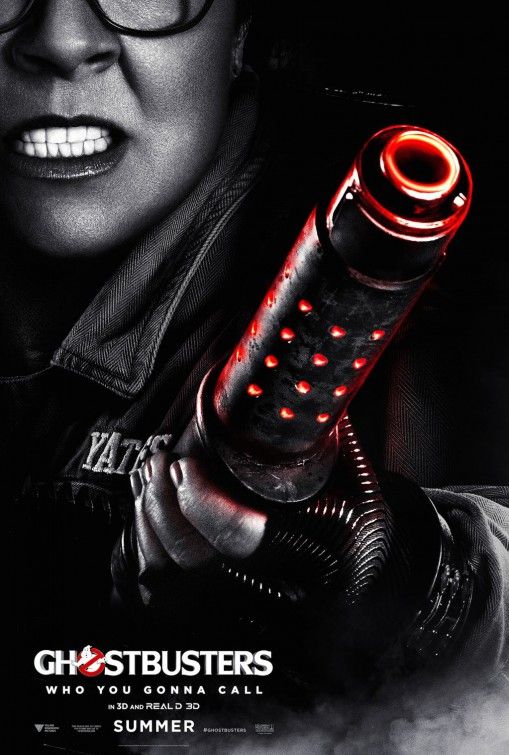
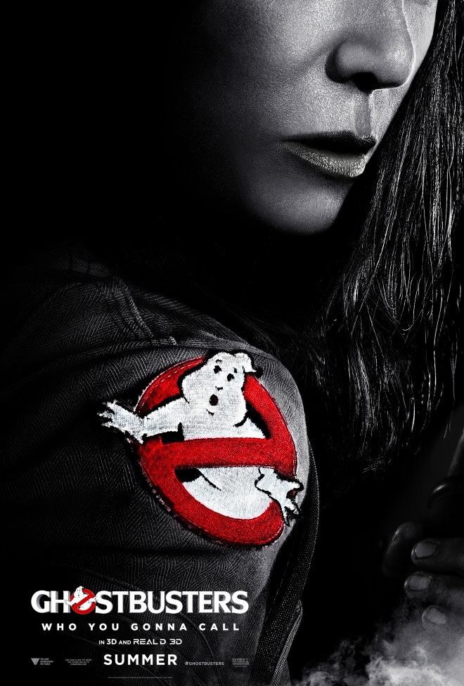
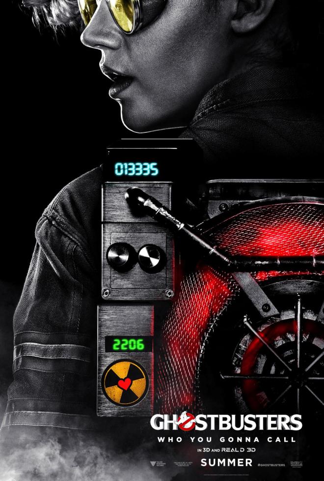
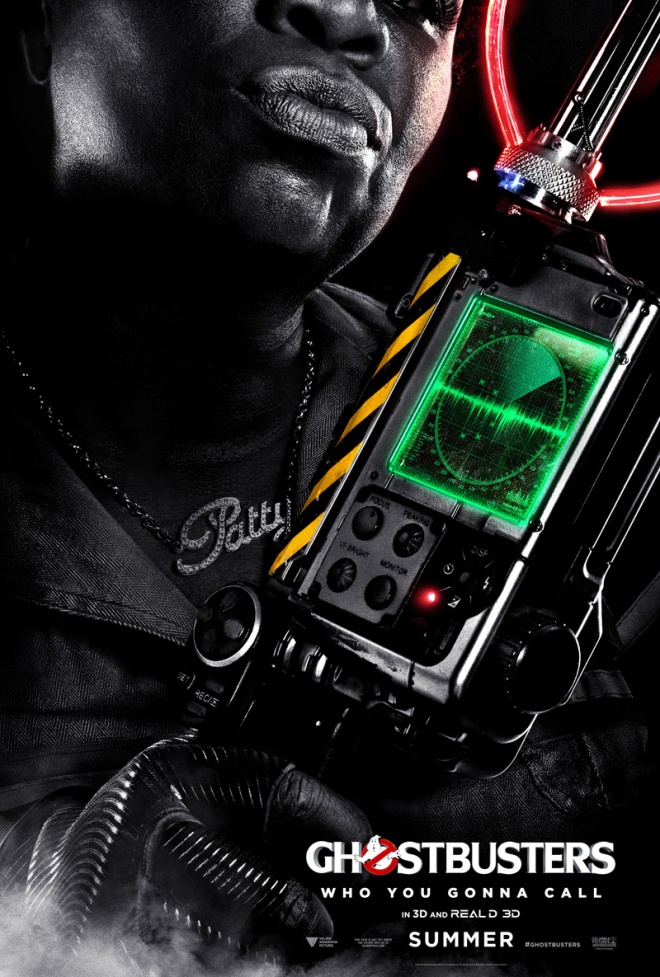
However, there is another series of posters for this movie, and I have to admit, they knock it out of the park.

d644409e36b3bf964dc36b0ae02d92b41271033 - THE WALKghostbusters-poster-kate-mckinnonghostbusterscharacter3

These are so cool! Such nice photography, love the black and white with a bit of color. Love the expressions on their faces. Love the variety of posing for the characters. I love how cool these make all of them look (because they are all super cool in the movie). You get a good view of some of the gadgets and the outfits. I just love everything about these. They all follow a similar layout with some variation (i.e. which side the text is on and how the characters are positioned) I think they work extremely well together.

I want them on my wall.

They make me want to see the movie, again.

These posters knock it out of the park for me. Absolutely.